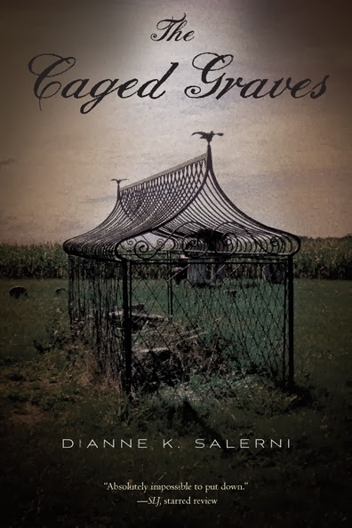
The paperback version of The Caged Graves will come out this August, and when it does, it will have a new cover. I showed it off on Facebook and Twitter last week, but in case you didn’t see it:
What do you think? I love it.
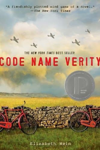
I admit I was nervous when they said I was getting a new cover, because I LOVE the first one. The girl is the striking image of Verity Boone as I imagined her, and I want to stroke and pet all the shiny gold curlicues around the title. (In fact, I have.) Also, I saw what happened to Code Name Verity when it went to paperback.
There’s no connection between my book and Wein’s book other than the name Verity, but I just cringed over the new cover. I searched the internet, trying to find the story behind the change, and I think it had to do with a New York Times review saying the first cover looked like a lesbian version of 50 Shades of Gray. But ugh, how was a pastoral landscape supposed to be better? Too far in the other direction!
Anyway, back to my book. This new cover makes the photograph of the caged grave more prominent. (It’s my husband’s photo, in case you didn’t know. Bob gets another photo credit!) And I think there’s a greater atmosphere of mystery in this new version. That’s what The Caged Graves is, a mystery in a historical setting.
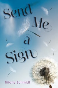
While I’m talking cover switches, let me just mention the new paperback cover for Tiffany Schmidt’s debut book, Send Me a Sign. Tiffany is one of the nicest people you’ll ever meet (I know. I met her. And not just on the internet, either.) I’m delighted that her new cover is an improvement over the old one!
Can you think of any cover changes that you’ve particularly liked or disliked?
Don’t forget — my Anniversary Giveaway is still running until the end of this month. Enter for more chances to win! Also, Marcy and I have 3 spots open in February for a first page critique. Make a good “First Impression” with editors, agents, and readers!


I like the new cover (but I loved the old one, too). I’ve been a fan of LJ Smith since the mid-ninetees and have seen her covers change over and over again with the reprints. I prefer the original ones, needless to say:)
I really love the paperback cover, especially how it’s darkened a little. As a reader, sometimes cover changes throw me. I find I end up searching out the older one and compare them. Then I ask Why did they change this or that? But it’s also fun, because I always find a different clue to the story and sense a new vibe.
I love your new cover! Heck, I loved the old cover, too. Win-win.
I also think Tiffany’s new cover is an improvement–it captures the feel of the book better, IMO.
My publisher is supposed to be changing the cover art treatment of my series starting with the next two installments, which are coming out in hardcover. I think I’ll be a little nervous until I see what they come up with. *bites nails*
I really love the new paperback cover, but I can understand your nerves after your experiences with the last ones! No connection at all!
Congrats on the new cover! It’s awesome!
I love your new cover. It looks creepier. And I really love the one for Send Me A Sign. I read the book (and loved it). The new cover is perfect!!!
That new one for Code Name Verity makes it look boring. I’m glad your book isn’t suffering from New Cover Syndrome.
I don’t know anything about paperback cover changes (I’ve never really noticed) but I’ve always thought that books with a different cover in the UK get the short end of the stick. UK designers generally use illustrations vs photos, which often makes things look cartoonish. Congrats on the new cover. It’s delightfully creepy!! 🙂
I really like the new cover. Your husband took a fantastic picture.
The cover for the paperback is great. Love it. I also liked the cover on the hardback version, so you now live in the best of both worlds!!!
Great paperback cover! I was relieved when Tor finally redid the awful covers on Robert Jordan’s Wheel of Time series. I dreaded carrying those things around with me.
I love you new cover (and I love the original as well). I’m shocked at Code Name Verity’s paperback. It looks like it’s not even the same book. I wish I understood the change. The Scorpio Races and The Forest of Hands and Teeth are two books I love dearly that I dislike all but their original covers.
The new cover looks terrific. (Good thing you’ve got an in with such a good photographer, eh?)
Ooh, yes, that new cover is gorgeous! And I agree with you about Code Name Verity.
Sarah Allen
(From Sarah, With Joy)
I think this is a great cover and I would so pick up the book to find out what’s going on here…?
PS. “Oh, Jesus Christ.” I am *still* laughing about your Mom!
Well, I’m not laughing *at* her, gosh no, it’s that story you told and I think your Mom could have been a fine sailor 🙂
Not that there’s anything wrong with sailors… I’m married to one
Oh, Jesus Christ, I’m digging a bigger hole here 🙂
Hi Dianne .. having seen a caged grave in Wales when I was there last year .. your new cover is brilliant – and I would want to know more. Code Name Verity – is cracked!! i.e. awful! Love the Dandelion one too .. that change is good, as you say ..
Cheers Hilary
It came out great! And, in case you didn’t notice, there’s something a bit spooky about it.
Malcolm